
Foothill Apartments: Canopy on the Corridor

Updated: Aug 9, 2025
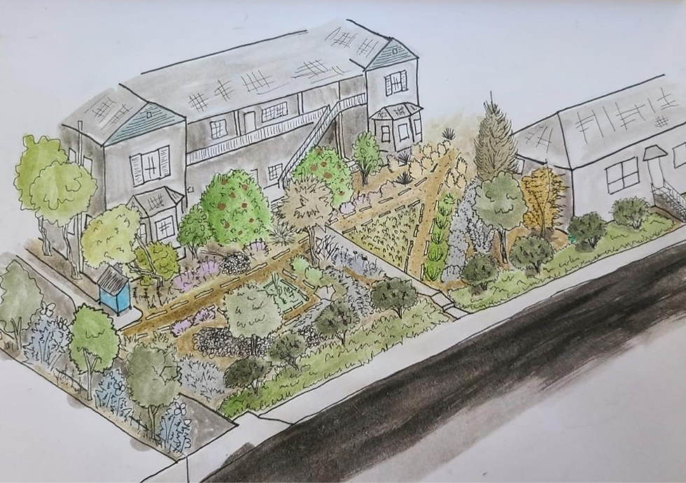
We’re excited to share our recent habitat landscape project at 311 E Foothill! Below are some pictures of the work in progress. We typically plant small 1-gallon plants to give the roots the best chance to establish and grow healthy, thriving plants. Because of this, the landscape will take some time to fully come to life, but observing and celebrating plant growth is an important way to connect with nature.

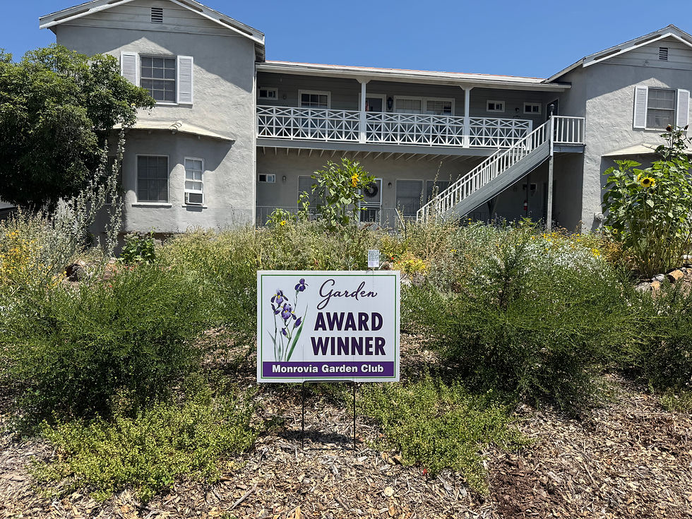
The goal of this project was to transform an underused, water-wasting lawn into a vibrant, resource-efficient landscape that enhances the area for tenants of this apartment complex. We’ve created inviting spaces such as a BBQ area, a walking path around the building, natural garden beds, and strategically placed trees and shrubs to block the noise from Foothill Boulevard. Our vision also includes planting large trees to soften the view of the building from the street, all within a limited budget.
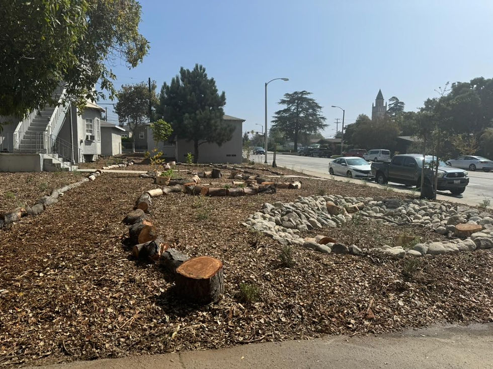
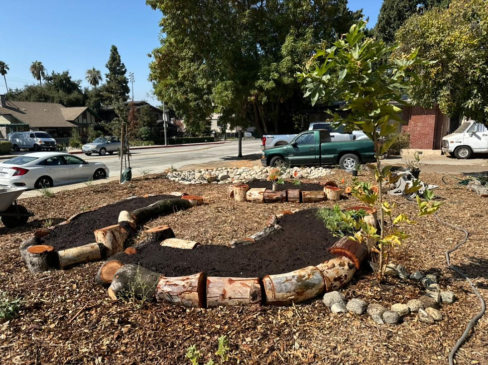
In addition to the two Valley Oaks we planted on the property two years ago, we’ve added 9 more trees: three sycamore, three western redbuds, 1 desert willow and two toyon (this is part of the 40+ trees that we have planted along Foothill Blvd in Monrovia so far). Our inspiration for this project came from the apartment complex at the north corner of Foothill and Mountain Ave, with its closely planted sycamore and oak trees, and the lush, tree-lined stretch of Foothill in Arcadia past Santa Anita, a route that many of us prefer to take over the freeway for the beautiful “tunnel of greenery.” Once mature, our planted trees will shade nearly an entire block along our main thoroughfare Foothill Blvd.
Another key focus was improving water management. We’ve rerouted the building’s gutters to a bioswale and dry river designed to capture and direct rainwater away from the foundation and back into our local aquifers, rather than letting it flow into storm drains and out to the ocean. This system helps conserve water right where we need it.




https://kubet.latino/ ban đầu mình cũng hơi lăn tăn kiểu mấy trang dạng này hay nhồi chữ với nhìn rối mắt, nên chỉ định lướt qua vài phút thôi, ai ngờ giao diện lại khá gọn và dễ theo dõi hơn mình tưởng, kéo xuống là thấy các khối nội dung tách rõ ràng chứ không bị dính thành một mảng dài khó đọc. Mình không đào sâu, chỉ xem cách họ trình bày tổng quan. Thấy họ có ghi kho trò chơi hơn 150 nên nhìn cũng “có số có má”, ít nhất là không cảm giác lèo tèo. Menu để vị trí dễ thấy nên chuyển mục không phải tìm. Nói chung vẫn giữ thái độ dè chừng thôi.…
PG55 mình thấy đặt thông tin nền tảng lên ngay đầu trang nên khỏi phải đoán mò, lướt vài dòng là nắm được họ đang nói gì; mình vô kiểu xem cho biết thôi mà kéo xuống khá mượt, bố cục chia khối rõ ràng nên mắt đỡ mệt, không bị kiểu nhồi chữ dày đặc nhìn ngộp, đọc vài đoạn là hiểu đại khái luôn. Có đoạn họ nhắc đã hoạt động gần chục năm và lượng truy cập mỗi ngày khá lớn, nghe cũng hợp lý vì ít trang chịu ghi kiểu “thông tin cơ bản” đàng hoàng như vậy; thêm cái mình để ý là phần nói về giấy phép họ tách thành mục riêng, nhìn như…
tg88com.io mình thấy bạn bè nói nhiều quá nên tò mò vào lướt thử cho biết. Vừa mở ra là thấy giao diện khá sáng sủa, kiểu chia nội dung theo từng khối nên nhìn không bị rối mắt. Mình chỉ kéo xuống vài phút thôi mà vẫn nắm được mấy ý chính kiểu họ nói về TG88 và định hướng iGaming 2026, đọc lướt cũng hiểu chứ không phải ngồi nghiền ngẫm. Cái mình thích là phần tiêu đề và đoạn giới thiệu đặt tách bạch, nên đang ở mục nào là nhận ra liền. Menu cũng để chỗ dễ thấy, bấm qua lại mượt, không phải mò. Nói chung cảm giác trang này làm theo kiểu “gọn gàng,…
https://sv368link.online mình lướt thử vì thấy bạn bè gửi, tưởng đâu kiểu trang dài lê thê mà vào lại thấy chia khối nội dung khá gọn, kéo xuống vẫn theo mạch nên không bị loạn mắt. Mình chỉ đọc sơ phần nói về hoàn trả, họ giải thích tính theo tổng thua lũy kế trong tuần nên hiểu nhanh, không phải ngồi suy từng trận thắng thua. Mấy tiêu đề về “link chính thức” với ưu đãi được làm nổi bật nên nhìn phát biết đoạn nào quan trọng, khỏi phải tìm. Menu/heading đặt rõ ràng, bấm qua lại cũng mượt, chữ không quá dày nên đọc đỡ mệt, nhất là mấy khung nội dung được tách riêng nhìn rất…
789bet mình thấy bạn bè nhắc nhiều quá nên tiện tay vào thử cho biết thôi. Mình không có chơi hay đọc kỹ gì, kiểu chỉ lướt vài phút xem trang nhìn ra sao. Vừa vào là thấy giao diện khá sáng sủa, khoảng trắng vừa đủ nên không bị rối mắt. Mấy phần nội dung họ chia theo từng khối rõ ràng, nhìn lướt là biết đang ở đoạn nào chứ không phải kéo mãi mới hiểu. Cái mình thích nhất là thanh menu đặt khá dễ thấy, bấm qua lại nhanh, dùng trên điện thoại cũng không bị lệch hay khó chạm. Nói chung mình chỉ cần vậy để nắm cách họ sắp xếp thông tin, vì các…